Monday, December 3, 2007

Jamie Vasta at Patricia Sweetow Gallery

Hurray! Glitter! Jamie Vasta’s latest series “Mustn’t” is absolutely stunning. Some of the pieces in the show made me experience a funny fluttery feeling inside. Before seeing this show in the flesh, I wouldn’t believe it was possible to make sophisticated, rich, virtuosic paintings in nothing more than craft glitter and wood stains.

The nine paintings on display at the Patricia Sweetow Gallery are fairly large (48” x 60”) works on wood panel. Vasta combines areas of thick glitter application with exposed, stained areas of the wooden supports. The execution of the work is tidy and controlled and it took quite a bit of careful looking to try and figure out how she creates these paintings. My guess is that she begins by projecting and tracing her source photos onto the panels, first stains the areas that will remain raw wood, and then begins filling in the blanks with careful combinations of colored glitter.

This series “Mustn’t” is based on Angela Carter’s feminist fairytale about two sisters who seduce a hunter and lure him into the woods in order to torture and murder him. Vasta uses her own photography as source material for her paintings, staging her actors like stills from a movie. I’m guessing she goes through a great deal of research, planning and sketches before shooting the photographs and creating the paintings. The care and flawless execution put into this show packs a powerful one-two punch. On the one hand you have splendidly executed images, whose richness and complexity of colors and textures dazzles the eye. On the other hand, you experience the pure joy of gratuitous amounts of girly glitter.

Clothed in lacey, flowing dresses, the women depicted in this story are seen at various stages of the narrative. In “As White As Snow” we see a woman shrouded in lace, ghostlike and seductive. The viewer plays the role of the seduced. In “Wil O’ the Wisp” and “The Beseecher”, we see a man, irresistibly drawn into the women’s trap. “Scarcely a Leaf Left on the Tree” is a tender but oddly eerie scene of a woman brushing a man’s hair. We start to realize something is amiss in “Cottontail“ and “Feral”, scenes of a woman skinning a rabbit, and of a woman dressed in animal furs, down on all fours in the forest like a wolf. Finally in “The Knife” and “In the Rushes” we see the women on the verge of stabbing the man to death. He is bound by plastic and gasping for air. The narrative of the story comes through strongly in the paintings and I think is successful in part by the photorealistic illusion of Vasta’s detailed work.

I wasn’t familiar with Angela Carter’s work before seeing this show. I will have to look up some books of hers. From her website I learned she was born in 1940 and had a great passion for classic literature. She spend much of her career rewriting classic fairytales and stories to include a more feminine bent. I’m intrigued and want to know more about her work. I’m thankful to Jamie Vasta for both inspiring me with her work and pointing me to a new writer to explore.

Images from JamieVasta.com

www.jamievasta.com
www.patriciasweetowgallery.com
www.angelacartersite.co.uk

Jamie Vasta – Mustn’t
Patricia Sweetow Gallery
77 Geary, Mezzanine
San Francisco, CA 94108
The show runs from November 1 to December 15th, 2007

Joseph Cornell and Louise Nevelson

Structure, Limits, and Freedom


I finally made it over to the SFMOMA for the Joseph Cornell exhibition. I’ve been a fan of his elaborate, enigmatic boxes since my art student teens (and he was a real working artist from a borough other than Manhattan too!). It was a kick to see so many of them, and alongside the collages, magazine covers, and assorted weird stuff he made.

Last month, after I saw the
Louise Nevelson show at the deYoung, I knew I wanted to explore her work in the context of issues raised (for me) by Cornell. I’ve always really liked her work, too, but for very different reasons. Cornell’s work is enigmatic, but in a playful and Surrealist vein; his work by using common objects and collage is so accessible as to be “user friendly.” The word enigmatic also comes to mind when I think of Nevelson’s pieces, but her choice of materials and forms most often convey a sense of austerity and discipline.

The show at the deYoung is large enough that one truly gets a sense of entering Nevelson’s world, so that a range of responses can develop over time to the body of work and themes emerge. Many critics go on at length about her choices to work in monochrome. My friend
Anna Conti had some very interesting thoughts about Nevelson’s sculpture being essentially a form of drawing. We all are drawn to various responses and concepts based on our individual “filters” (though most professional critics would deny that they have personal filters and instead come up with more hifaluting verbiage about theories...).

One of my own filters for art comes from my personal sense of what the creation of art does for me:
it helps me mediate reality. So I look at all these structures Nevelson has built and I see as a unifying structure rectangular grids or boxes that contain enigmatic elements....just like Cornell’s boxes. And I wonder if each of them needed that structure to help make sense of the world.

It could be that the linear structure imposes order on chaos. Both of them, if you read the critics, are dealing with capital-I “Issues”: Nevelson with the Holocaust and social issues, Cornell with various infatuations and interest in nature and in how the world works. A box is both literally and metaphorically a marvelous device to “tame” or control big problems or things that threaten to be overwhelming. Nevelson’s discipline and Cornell’s obsessiveness each in its own way could support this theory.

On the other hand, it could simply be that having the linear structure is a useful starting point for entering into the creative act. Many artists and artisans like the idea of solving a problem or a puzzle, and setting specific parameters is an easy way to do this. One might do a drawing every morning in a 3" x 5" pad, design a series of houses that fit a 25 foot wide lot and touch the houses on either side, or write about life and death using the sonnet form. Once a form is mandated, there is freedom to proceed within it.


I think this is why some of us in the martial arts really get into learning kata. The steps of the kata are the structure. The form is mandated. Once you accept this as a given (and have a certain proficiency), there is freedom to explore endless variations: what happens when my weight shifts from the ball of this foot to this heel before I start to raise my sword? If I exhale while turning my head, do my shoulders do something that affects my stance? Do things change if I conceive of this movement as a pulling rather than as a pushing?

These two exhibits and the martial arts I've studied demonstrate how a good structure can serve as a lifelong learning or creative tool. Chose or build your's well !

(This post was copied from Janet Rosen's Blog, Zanshinart)

Show at Gruenwald Press

Article with photos up at Civic Center:

http://sfciviccenter.blogspot.com/

Sunday, December 2, 2007

Mission Greenbelt at the SF Arts Commission

Mission Greenbelt Headquarters initiates a new SFAC Gallery exhibition series, Winter Workshop, which is designed to support artists engaged in the creation of long-term projects through providing space, administrative support and funding at an intermediary stage of the generative process. After a call for submissions, the staff of the SFAC Gallery chose Amber Hasselbring’s community-based urban earth artwork project, The Mission Greenbelt.

About the Project:
The Mission Greenbelt project will inspire and enable San Franciscans to begin growing an urban earth artwork. The Greenbelt will consist of neighboring native plant sidewalk gardens in front of homes, apartment buildings, storefronts and schools between Franklin Square Park and Dolores Park. In addition to improving the environment and creating a habitat for birds, insects, reptiles and small mammals, the project will unite and strengthen a community.

From November 10 to December 22, 2007 the San Francisco Arts Commission Gallery transforms into Headquarters for the Mission Greenbelt Public Awareness Campaign. Headquarters is the central meeting place for Mission Greenbelt researching and campaigning. Headquarters also hosts a multi-media art installation, free public events and hands-on workshops. Visitors of all ages are invited to visit Headquarters and join in the effort to create a new San Francisco Greenbelt.

There is a Native Plant Demonstration Garden in front of the San Francisco Arts Commission Gallery which is made possible through a partnership with Nature in City’s Education & Stewardship Committee.


http://www.sfacgallery.org/information.fsp
Artist: Amber Hasselbring

The best piece on this is a funny, well written essay with neat photos up at SF Mike’s blog (image from his blog as well - permission granted to link). In fact, if you are interested in music, politics or art in the Civic Center, it's just a great read!

http://sfciviccenter.blogspot.com/2007/11/mission-greenbelt-campaign-headquarters.html


Friday, November 30, 2007

Benefit Art Auction at Maverix Studios


This coming sunday Maverix Studios is hosting an Art Auction Fundraiser for Glide Memorial Church. The benefit's proceeds will go to support Glide's Childrens Creative Arts Media Center. From the Maverix blog: "The evening will include food, drink and the music of our talented DJ’s. Original and digital art from prominent contemporary artists will be up for bid in a silent auction, with the evening culminating in a live auction for the most sought after pieces! It is a great opportunity to get the jump on holiday shopping and support a wonderful organization working with and for the underserved children of our city." Maverix Studios is in San Francisco's Potrero Hill at 1717 17th Street. The event starts at 6pm and ends at 10pm.

Tuesday, November 27, 2007

Matisse at SF MOMA


I love to revisit the permanent collections in our various museums. We are lucky enough to have a very nice (if small) collection of Matisse's works at the SF MOMA. I remember when I first saw this piece at the old SF MOMA on Van Ness. When you got off the elevator on the top floor, it was facing you as you entered the museum. Even now, in 2007, although not as well placed as it was in the older museum, it still has the power to shock and impel.

In Femme au Chapeau, Matisse took the familiar form of the salon portrait and turned it on its head. He discards perspective, shadows, and three-dimensional space, in fact, any attempt at realistic portraiture. The subject is Matisse’s wife, Ameile Matisse. She is seated in a chair with her back turned somewhat toward the viewer. Her head is placed exactly in the center of the canvas, topped by a huge Edwardian hat. Her gloved hand rests on the arm of a chair and she carries a fan in her other hand. She looks over her shoulder at us, her small head tilted, with a look that is vulnerable, determined and melancholy.

Madame Matisse looks at us from beyond a barrier of color, her face overshadowed by the huge hat, which takes up the upper third of the picture frame. But what a face, what a hand, what a chair – all bursting with vibrant, indeed garish color! Her mask-like face hides more than it reveals, yet still shows a melancholy sadness that comes across through the strong colors. The colors are not blended and discordant, seemingly dashed upon the canvas with strong and fluid brush strokes. She looks at us but from a psychological distance; the bright colors both attract and then repel with their acid harmonies. The painting still radiates a ferocious energy that is at odds with the vulnerable melancholy on her face, the down turned drop of her mouth and the guarded expression in her eyes.

Impressionist paintings seem to glow with an internal light and generally reflect a sunny, peaceful world. The light from Femme au Chapeau is neither sunny nor peaceful but emanates from the flattened surface. The flat areas of color around the red-green, orange-blue axis invite us to view the surface of the painting but never invite us into the space as did the softer, more inviting space of Impressionist painting.

In this work, Matisse painted from his own emotional response, rather than from an attempt to reproduce (more or less realistically), on canvas what he saw in front of him. His brilliant and harsh colors give the painting surface a force and vibrancy. He was composing a painting, not describing nature, a person, or a thing. Femme Au Chapeau verges on the edge of abstraction but does not go over. reflecting Matisse's own definition of Fauvism as "The search for intensity in color, the substance being unimportant. Reaction against the diffusion of local tone in the light; the light is not suppressed, but expressed in a harmony of intensely colored surfaces.”

For Matisse, the Fauvist period was only one stage in his artistic life. He would later reject what he saw as some of the more excessive aspects of Fauvism, but it could be argued that it was Fauvism and his experiments in color that liberated him emotionally and enabled him to paint the calmer and more decorative works that were to come. We are the beneficiaries of his struggles and for me, his works never become boring. I find something new every time I look.

http://collections.sfmoma.org/Obj213.htm
http://cgfa.sunsite.dk/matisse/p-matisse13.htm

Further reading:
Elderfield, John, The “Wild Beast” Fauvism and Its Affinities. Oxford University Press, New York, Toronto, 1976
Guichard-Meili, Jean. Matisse. Praeger, New York and Washington, 1967
Janson, H.W. The History of Art, Volume II. Prentice Hall, Inc, and Harry N. Abrams, Inc. 1995
Spurling, Hilary. The Unknown Matisse: A life of Henry Matisse: The Early years, 1968-1908. Alfred A. Knopf, New York, 1998.


Monday, November 26, 2007

New Blood at Sausalito's ICB Artists' Studios

30 year ICB Artist Elaine Gentile welcomes newcomer Dana King.

Sausalito's Industrial Center Building, the ICB, is zooming into its 40th year as an artists' building with new energy, new blood, and a great new PR Program.

All this is just in time for OPEN STUDIOS:
PARTY NOVEMBER 30TH 6-9 pm;
DECEMBER 1-2 SATURDAY AND SUNDAY 11-6
480 Gate Five Road in Sausalito.

We have a new PR program that's putting us on TV, You Tube, in the press and bringing writers and media people to our special press previews. You can search on You Tube and see a bunch of us already online. Everybody is psyched for Open Studios this year. The whole building feels electric, energetic and professional. We hope the public reading this and ALL the ARTISTS will come. The margaritas are in Studio 259D, that's me Sherry Miller, and everyone else participating has lots of food, drink, art, humor and music to offer.

Some recent events:


David Perry, ICB PR Guru at October 19th Press Preview - 300 attendees


November Marketing Tips for Artists. Presentation by
David Perry at ICB in Anne-Marie De Rivera and Jody Keane's Studio


Francis Galli (left), 89 years young, and painting every day,
takes time out for the October 19th Press Reception.

Wednesday, November 21, 2007

Black Friday at Frankenart


Happy Thanksgiving to everyone who writes here and to any readers we may have accumulated. Hope you all have a good meal somewhere tomorrow. As for the next day, if you're undecided on participating in Black Friday, try this instead: Leslie Henslee hosts a green alternative at Frankenart Mart, the tiny experimental art gallery in the Richmond with an interactive art lab.

On Friday, from 1pm to 8pm, Frankenart Mart is hosting a "make a children's book" kinda event. I say "kinda" because it's hard to define what goes on there. I've participated in the events here in the past, plan to participate in this one, and still can't find the words to describe it. The Frankenart manifesto states, in part, that it aims to be "an inclusive meeting ground for artists, audiences and community members that blurs the boundaries between them."

(image is the Frankenart "Maps & Routes" show in May 2007)

Friday, November 16, 2007

Emerson Woelffer at Hackett-Freedman


Hackett-Freedman Gallery presents a selection of 1990s paintings by pioneering California abstract expressionist painter Emerson Woelffer (1914-2003), November 2-December 22, 2007

The show is important for historical reasons and their web pages are not only beautifully designed but full of information. In fact, what they do with their site could (should?) be a model for other gallery websites. I particularly appreciated hiis use of textural and geographic shapes set within a somber palate.

http://hackettfreedman.com
(image from the website)

Rob Harrell, Recent Oil Paintings at Hespe


Moody images of women, painted using traditional oil techniques. Quite interesting technically with a bit of a Hopper feel in the best pieces.
http://www.hespe.com/ (image from website)

Elaine Coombs at Hang Art


Her technique is “reminiscent of the pointillist painters of the 19th-century French Impressionist movement, most notably Seurat. Rather than using a brush, she carefully applies paint in small dots using the tip of a palette knife.” The pieces are quite lovely and do convey an impression of stillness and peace.

http://www.hangart.com/
image from gallery website

Kris Cox at Ellins/Elkins (49 Geary)


Cox combines squares and rectangles with text on nicely textured canvas. The work is pleasant but lacks (in my opinion) much of an emotional charge. Of course, that may not be his intent. As they say, YMMV. Of course the gallery has a roster of good artists that they represent and have always, in my experience, been willing to show you works that are not on display. I particularly love Pia Stern and have had "private" viewings of her works from the back room but there are many others to chose from.

http://www.eesgallery.com/ (image from gallery website)

Tuesday, November 13, 2007

Web design and Art


I absolutely fell in love with this website, such a great concept and beautiful design. GYRE, designed by Shun Kawakami, happens to be the website for a commercial center in Tokyo's Omotesando district. When I visited this site what immediately came to mind was an art piece I saw a couple of weeks ago in the "Dark matters" exhibition at the Yerba Buena Center for the Arts . The idea of one of the installations at YBCA is very similar to the GYRE website. The piece is called "Internet-eavesdropping installation Listening Post" by Ben Rubin and Mark Hansen, in which random information from blogs and chats from the world wide web is shown in real time on little led screens. This is what it looked like. When I saw the Gyre website I couldn't help but feel that its designers had taken a very similar concept and made into something even more artful then the piece at YBCA. The commercial setting is perhaps what might prevent us to call this website "art", but wouldn't you agree it belongs in an art museum just as much?

Monday, November 12, 2007

Amy Sillman SFAI Lecture November 5th, 2007
Amy Sillman uses her own invented visual language to create abstract paintings that skirt on the edges of graceful calligraphic expression and noisy, gestural awkwardness. She appropriates some of the formal styles of abstract expressionism and neo-expressionism while leaving the ideological baggage behind. As she said “I’m making fun while having my cake and eating it too. ”She mentioned her strong distaste for the Salle/Schnabel egotism while admitting that she employs a kind of awkward, wrong formalism that exists in expressionism.

Sillman names Phillip Guston, Louise Bourgeois, Jean Arp, as some of her biggest influences and inspirations. She seems to always have one foot in sculpture with her work, both in the way she deals with shapes and her desire for very thick application of paint. She talked about being interested in sculpture because she didn’t have any training in it and she saw it as a way of seeing things in a new light. She uses thick paint on canvas, building up sometimes inch-thick paint on her canvases.

Although Sillman is interested in a painterly surface, she wants her content to escape ornamentality. She strives for awkwardness of line and form. She says “people aren’t always driven by desire” and she is looking for that something else, ugliness, sadness, dismay, cynicism that she feels is more real than beauty. Despite her attraction to the ugly, Sillman’s paintings are beautiful. She has a powerful relationship with color and uses it as a one of the key elements of her invented visual language. She pairs bright, optimistic colors with muted, weighty colors. The result is a complex palette that could make an ugly painting beautiful.

Sillman says she would have been a linguist if she had a teacher that was any good. Instead, she had a bad linguistics teacher and a great drawing teacher. She said once she made the connection between calligraphic line and gestural painting, it was all over for her, she had found what she was looking for.

Sillman is a firm believer in getting things wrong. Could it just be accident that anyone winds up as an artist? You start on a path, then find that you’ve strayed from your original path and discover you like it better there anyway. She believes good artists all have a love/hate relationship with painting. It keeps them constantly questioning, and constantly discovering.

As a lecturer she is funny, articulate and charmingly scattered. She talked through her nervousness while getting loud laughs out of the audience. You can’t hope for a better artist lecture. Her connection and understanding of her own work is energizing. She comes off as both modest and confident. And though I wasn’t very familiar with Sillman’s work prior to this lecture, I now feel like a Sillman fan.

Amy Sillman is currently showing a new group of prints at Crown Point Press in San Francisco until December 29th, Visit crownpoint.com for more information on the show.

You can view more of Ammy Sillman's work at:
Saatchi Gallery
Sikkema Jenkins & Co.
Artnet.com

Bill Dunlap at Bucheon

dunlap_7.jpg

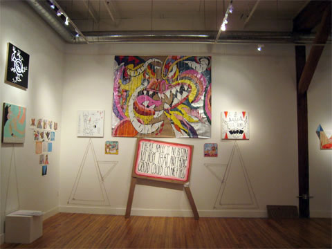
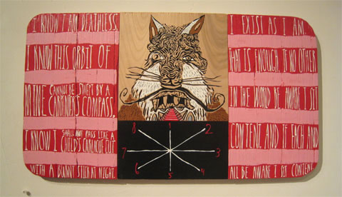
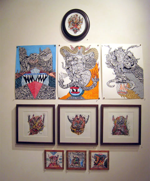
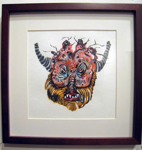
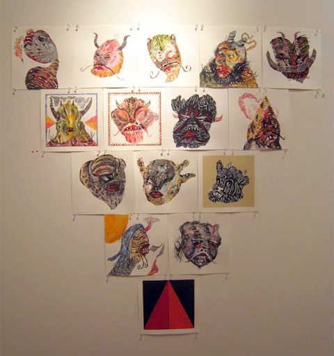
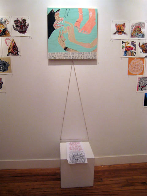
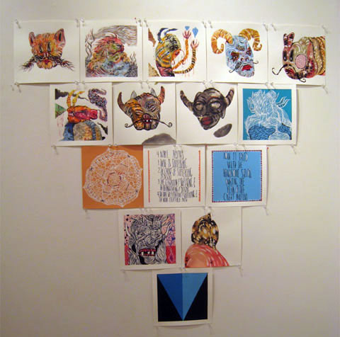
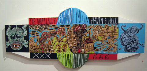
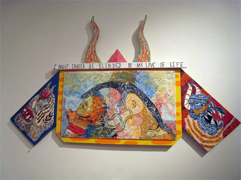
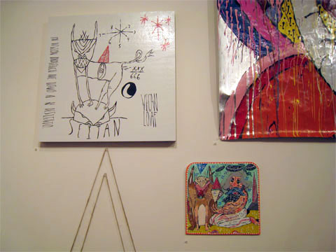
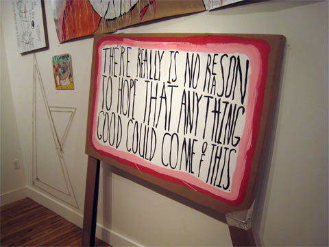
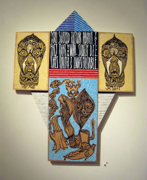
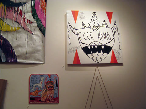
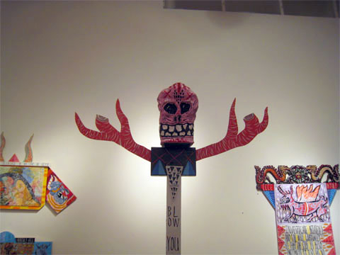
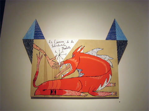
Bill Dunlap has a well developed visual alphabet with references to the magic of triangles, demons, angels, spirits, and incantations. A number of his colorful works contain snippets of words, sort of non-sequitur phrases that, when paired with his inked and painted monsters, look like visual magical spells. Whether these spells attempt to ward off evil or invite evil to dinner is hard to decipher. Bill is probably the only one who knows for sure.

dunlap_2.jpg
dunlap_3.jpg
dunlap_4.jpg
dunlap_10.jpg
dunlap_11.jpg
dunlap_12.jpg

I remember seeing Bill's work at the now defunct National Product a few years ago. At that time the work was more character driven and less contextual. Bill's personal folklore reminds me of Howard Finster's work, especially when there is a juxtaposition of text and images with each occupying its own shaped cell or area within a constructed piece. It's exciting to see these constructs as well as the ink line works. Many of the works in this show are quite affordable. I bought a devil watercolor for $150 which is quite a steal.

dunlap_20.jpg
dunlap_19.jpg
dunlap_13.jpg
dunlap_14.jpg
dunlap_15.jpg
dunlap_16.jpg
dunlap_17.jpg
dunlap_18.jpg

Bill Dunlap's show runs through the end of December at the Bucheon Gallery.

Bucheon Gallery
389 Grove St. San Francisco CA 94102
Hours: Tuesday - Saturday 11am-6pm
(415)863-2891
email:bucheon@earthlink.net

Friday, November 9, 2007
Jeff Wall


Jeff Wall, Picture for Women, 1979

Most of us see art mainly in reproduction; it's a blessing and a curse. But if you're used to seeing Jeff Wall that way, his current retrospective - now at SFMOMA - will hold some surprises for you. Not the least of which might be the monumental cheesiness of it all.

The truth is that it's virtually impossible to disassociate Wall's lightbox format from the advertising displays that were its source. The consequence is a disorienting sense of having been transported from an art museum to that cathedral of 21st century anomie - the airport.

At the same time, the artificiality of Wall's display format perfectly complements the contrived nature of the photographs. I've complained before about Wall's contrivance - here, for example - but I take it all back now. In fact, I think it's essential to the ultimate success of the work that we know it was staged.

Also essential is the triviality of Wall's subject matter. Lots of subjects would be ludicrous in this format, but Wall's pedestrians and disco kids work just fine. If these photographs weren't staged, you might feel compelled to wonder why he took them. The fact that he made them up somehow obviates that question. Like reality tv, you know they were meant to be cheesy.

But simultaneously cheesy and pretentious as it is, this show works. Refracted through our knowledge that each of these scenes is the premeditated creation of the artist, the trivial subjects and grandiose displays set up an emotional reverberation that is sometimes annoying, sometimes boring, but often thrilling.

At SFMOMA until January 27.

Wednesday, November 7, 2007
Selling Out (podcast)

KALW's weekly arts & culture radio show and podcast, "Artery" usually covers performing arts but episode #30, "Selling Out" looks at the intersection of business and art, with a story about San Francisco's Southern Exposure Gallery.

Last year Southern Exposure was forced out of the location where they had spent 32 years, when the building was undergoing an earthquake retrofit.

The temporary location at 25th & Mission, an old flower shop, was more appropriate for retail than exhibition, so they decided to go with it, and they created an artist residency program "with an an opportunity to create and launch the framework for a business utilizing their creative skills. From a pie delivery service, a clothing company, and quarterly, mail-order subscription-based art project, "Free Enterprise" provides new inventive and creative services to Bay Area residents while creating real opportunities for artists to make a living."

They interview Southern Exposure director, Courtney Fink and one of the artists involved in the residency, John Herschend.

Listen to the episode here (8.5 minute mp3 file).

Southern Exposure has moved on and they're reopening on November 9th in a new location: 417 14th Street @ Valencia

Photo of SoEx storefront by Corinne Schulze, via

Joseph Cornell at SFMOMA


Joseph Cornell: Navigating the Imagination at SFMOMA

I’m a big fan of Cornell. Up until this show, I’ve seen very little of his work in person. SFMOMA has several pieces in their permanent collection but they are only occasionally on display. From now until January 6th you can immerse yourself in Cornell’s world right in your own backyard.

When approaching the exhibit by stairs the first thing one sees on the 3rd floor is three interesting photographs: the family house in which Cornell spent all of his adult life located in Flushing, New York (he worked in the basement studio), a photo of a very gaunt looking Cornell working in his studio, and Cornell’s collections of objects, boxed and labeled. The photos are intriguing. They add to the mystery of Cornell’s art. Every time I look at this exhibit I find myself spending a lot of time with these photographs.

Cornell began his art career by creating collages. Interestingly I’ve read that he was so meticulous with his work that he never overlapped images but instead cut and fitted the collage pieces together. Cornell began working with commercially made boxes until 1936 when he learned to make his own.

The show is nicely curated. The first gallery you step into is called “Navigating a Career 1931-1971” which gives one an overview of Cornell’s work. The viewer sees boxes and collages representing Cornell’s many themes. My favorite display in this room is the glass case containing Cornell’s art materials. This is an interesting collection of paints, brushes, tools, jars, cylinders, pipes and other things. It gives some clues into the artist’s process. The other galleries are arranged according to theme, such as “Geographies of the Heavens” and “Nature’s Theatre”. Cornell is often associated with the Surrealist movement but was never an official member. He was friends with artists such as Marcel Duchamp and Max Ernst. Their influence is clearly seen as you visit the galleries.

Cornell’s boxes are little worlds unto themselves. Cornell didn’t venture outside New York but he was an avid armchair traveler. I like to picture him in his little boxlike basement traveling to other places in his mind and recreating those worlds in his boxes.

As you look at Cornell’s work consider themes of time, female celebrities, metaphysics, nature, the cosmos, birds, games, toys, hotels, palaces, and spirituality. Look at his materials and colors. The color blue is seen repeatedly and is also painted on the gallery walls. Ask yourself, “What do these objects mean and how are these objects related?”

Some of the personal appeal of this show is that many of Cornell’s works remind me of my trips to the “Bargain Basement” in the Chicago area as a young girl. It was a consignment shop often selling pieces of furniture with all their original contents. While my mother and grandmother shopped I’d station myself in front of a dresser and start rummaging through someone’s life. Cornell’s work carries that sort of curiosity. The boxes have drawers that if not left open for us to peer into, tantalize the imagination.

One of my favorite pieces “Cabinet of Natural History: Object, 1934, 1936-40” is a chest full of labeled corked vials filled with various objects. Only some of the labels are visible, such as “Photographie” and “Mirage”. We are left to wonder how these titles relate to the content of the vial. This piece and others are based on curio cabinets, containing mementos from travels usually displayed in living rooms and popular in the early 20th century.

I can’t say enough about this show but also I don’t want to give away all its secrets. Perhaps you’ll see me there, gazing intently at one of the “Soap Bubble Sets” or bird aviaries, contemplating the mysteries of the universe and how it feels to be a bird trapped in a cage, or perhaps an artist who only needs his imagination to travel the infinite abyss of the mind.

Image borrowed from www.sfmoma.org

F.F. Interviews Oakland Artist, Nancy Chan


Chris Pew talked to Nancy Chan, who paints isolated figures in black ink. She takes photographs of the models, and makes series of each subject. In the artist's words:
"My sumi ink drawings are, in a sense, portraits of figures interacting both with other figures and the spaces around them. Many of them are works in a series, and deal with a quiet intimacy between the subjects, the space, and the viewer. The sequential nature combined with the detail work is essentially a long, close study of all the little things that occur in a few seconds time - weight shifts, heads tilt, fabrics fold."

Read the full interview at F.F.
Image is installation view from the artist's web site: seeinsidefordetails.com

New work in Berkeley, San Rafael, and SF

The Steinberg Farmer Report just posted eight short reviews of gallery shows around the Bay, including this one from SF:

Kelly Reemsten at CaldwellSnyder Gallery
Kelly Reemsten opens her first show at CaldwellSnyder with Recent Paintings, a delicious look at 50-60s fashion and furnishings. Reemsten liberally applies luscious layers of oil paint with an ever present hint of orange. Let me tell you, this woman can paint!

I was fortunate enough to be in the gallery while Kelly was inspecting the installation; hearing her insights and inspirations was remarkable; her work ethic really made me take notice. Reemsten is able to complete a full body of work approximately ever six months. She feels it her obligation to her collectors and viewing public to have new work available.

Now that Reemsten has gone back to LA, don’t fret; Roger Azevdeo, CaldwellSnyder’s charming secret weapon, will effortlessly guide you through the exhibit and give you all the 411 you’ll need for an enjoyable viewing experience. Roger is committed to great art, he believes in the work he sells, and is a huge resource for the Bay Area art scene. Wish there were more like him. www.caldwellsnyder.com

Image from the Steinberg Farmer Report - more here.